

Designing Website Forms That Convert Leads

Your website form can be the nexus of website visitors connecting with you. Making the right decisions of your website form can make a huge difference in how many of your website visitors do connect with you. Here is a guide on some ways to improve your form to convert more leads.
Don't ask for too much from your form.
Did you know that for each additional field that you add to your form you will lose 10% of potential form submissions? Do you really need to know all the information that you are asking for in your form just to create a first connection?
Many case studies have shown dropping a couple fields doubling and tripling the amount of leads that they receive - so if your leads doubled or tripled would that be worth having to wait for the second connection to obtain that particular data? So reduce what you are asking for in your form to only what you absolutely need.
Often, that can just be a name and email. Some fields are more volatile than others - it is generally shown that changing a phone number request to email will increase 5% of conversions because people are more comfortable receiving an email than a phone call.
Often when you ask for too much information, the user will either not complete the form or provide false data. So don't ask for too much from your form, and you might get a lot more requests from your website.
Give a sense of quick and easy.
While there are lots of ways to give a sense of quick and easy - one of the best ways is to put a progress bar at the top of your form. This lets the web user see how far they have to go and will encourage them to get through it by this quick and easy sense. Another tip is to have it not start at 0%. If you start at 25% before they even start, it makes them feel invested before they have even invested - and again gives a sense that they are almost done.
Don't be all like... formy.
One of the best bits of advice that I can give you is to make your form not look like a form. This can be done by making it more of a visual experience using images and it can also be done by making it look like a website tool instead of a signup form.
Many websites are using push button images instead of selecting dropdowns or radio buttons. If not this - I highly recommend using images within the form to improve the user experience.
Many websites use the impression of a tool or audit while capturing email addresses for leads and potential clients. This is a great way to lure the web user into walking through steps to find what they are looking for while you are collecting information about them, and then somewhere in there collecting at least an email address for future marketing campaigns.
Buy them a drink before you ask for their number!
While it may seem logical to first ask for personal information like name and email because that is the most valuable information to you, this is akin to walking up to someone you have never met and asking for a number. Might work sometimes but you will have greater success if you ask a few friendly questions first. Wait until they already feel invested in the form before you ask for an email address or phone number, but make sure you receive it before you provide the value the client is looking for (like a listing of properties found from a real estate search they queried).
You can lead a horse to water but you can't make them drink.
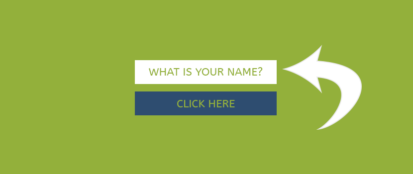
Make sure you lead the web user to your form. You will want to minimize distractions and you can do this by using a lightbox or graying out the other content, or even as simple as removing additional page elements on your form page. You can also use borders, contrasting colors, and shapes to draw the eye to the form. A pro tip would be to use directional cues like arrows to point towards the form, or even faces with eyes looking at the form to draw the eye.
Give Social Proof.
One of the keys to converting leads is to gain trust. If you can offer text or images that gains trust you can increase the amount of web visitors that become leads. This is especially important here on your form page where they are making their final decision about whether they will reach out to you or not. Providing copy such as "x number of people have downloaded this software." or "trusted by 100,000 people" or even something like "no download required" gives the user a sense of calm and trust that might push them to complete the form.
Keep It Simple Stupid.
I recall my highschool art teacher had a sign on his desk that said KISS - keep it simple stupid. It is something I often remember in many aspects of web design, but especially in form design. Making a simple and easy process it only going to make less people abandon the form before completing it. Single column forms convert more than multiple column forms, and every month mobile usage goes up this becomes more true.
Use radio buttons instead of dropdowns so the user can see all the options before having to click anything.
Don't be so restrictive about the formatting of the content. Asking for date or phone number only in certain formats results in errors... Ask yourself how often you are willing to retry a form that you are filling out that isn't easy to use.
Don't lock the doors.
You can lock the doors to keep spammers out by using a captcha, but you will end up locking out potential clients as well who have no interest in filling out captcha boxes. While there are captcha boxes that can be easier to use, if you are anything like me - you get anxiety when you see those characters show up on a form. Is it case sensitive? Is that a five or an S? What order are these supposed to be in? Captchas are the worst. You can use this tactic instead if you like... but definitely do not add a captcha on your lead forms.
Verbiage matters.
While you may spend less time working on the wording of your form titles and tags - this might be one of the places you should spend more time. This is the selling moment. If you were helping a client in your store/office would you turn the charm off when it got close to the sale moment? Consider your verbiage. Be conversational. Explain what value they are receiving and how absolutely fantastic it will be and how it will change their life. From your placeholders to your call to action button - this is uber important.
Get the submission.
Make sure your call to action button is making it virtually impossible for them to look away and click off the page. Make that button color contrast, make the verbiage entice (submit doesn't do it for anyone), and make sure that button is as wide as all the fields are on the form - don't take the most important element and have some teeny tiny button off to the side.
BONUS :: TESTtestTEST!
The best thing that you can do to improve your conversion rates is to test test test. Use A/B tests in order to see the best color choice, the best verbiage, and the best layout. You will be amazed at how testing what works best for you and your goals makes a difference in your level of success.

We thought you might like to see these other posts about web design...
 How to Make the Perfect Meet the Team Page
 What do I need to have a website?
 Real Estate Web Design :: What do i need to know before i get started? About The Author
Kim Young is Founder, CEO, and a developer at Foo - a web development company based in Wesley Chapel, Florida. She can also be found on Google+. With over 16 years of experience as a web developer, Kim is excited to share with you tidbits that she has picked up along the way. Kim prioritizes continuing education and out of box thinking in order to bring the most valuable solution to Fooweb's clients.

|

|

|
Let's Do This!
We are so excited to hear more about your organization and chat about how we can drive more traffic your way. Reach out to us now and get a free quote.
Request Pricing Now
What We Do
Web Design
Web Development
Cloud CRM Solutions
Logo Development
Web Hosting
Search Engine Optimization
Search Engine Marketing
Email Marketing
Social Media Marketing
Content Marketing
Featured Projects
Wayne County Sheriff
Hope Sails
Redline Express Courier
W&S Auto Center
Chainbrain
Victorious Life Church
CED Engineering
Realty Executives
Africa Expedition Safari
Grace Community Church
Caite
Projects by Industry
Attorney Web Design
Engineering Web Design
Fashion Web Design
Insurance Web Design
Landscaping Web Design
Medical Web Design
Non Profit Web Design
Real Estate Web Design
Retail Web Design
Sports Web Design
Travel Web Design
Contact Us
Suite 172
7810 Gall BLVD
Zephyrhills Florida 33541
PO Box 7444
Wesley Chapel, Florida 33545
Text or Call 813-360-0932
info@foowebs.com

 © Foo Web Development LLC Web Design & Development Serving Clients Worldwide Client Login RSS Feed Feedburner